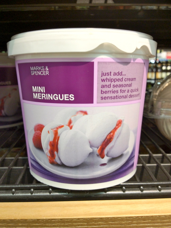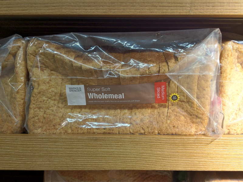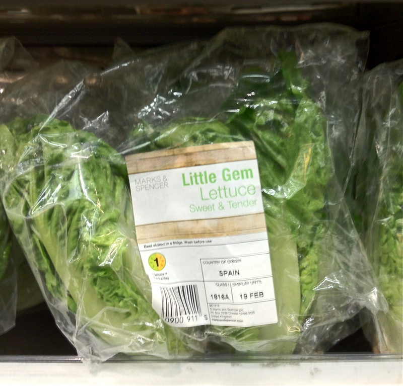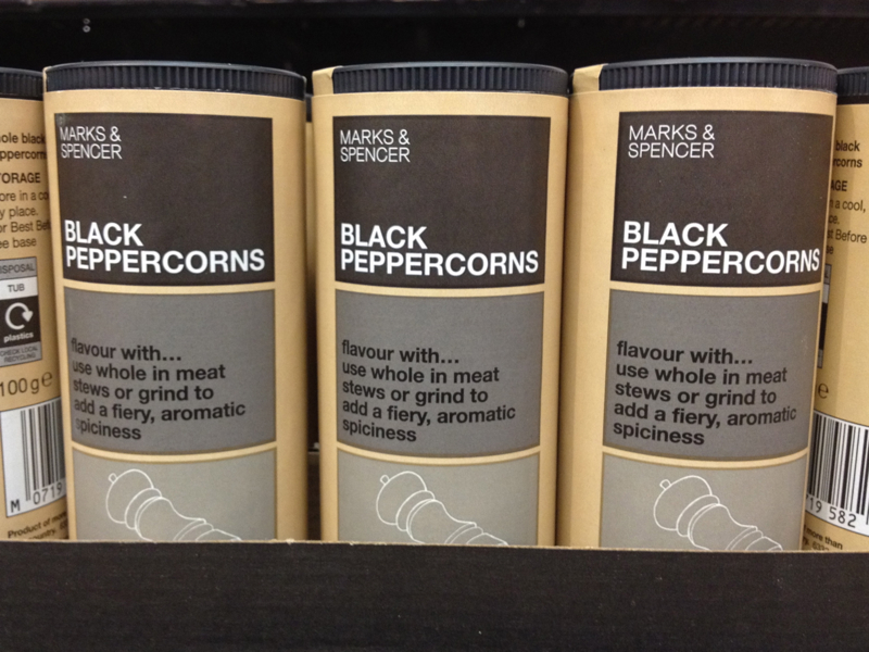
As a quick follow up to a post about my love of less options and simply designed generic products, Marks + Spencers of London has a nice approach. Not as clean as Canada’s Loblaw’s and certainly not hitting the Pathmark NO FRILLS circa 1978 gold standard but commendable.
A more modern design style with a bit more color and imagery used but it still has a clean and very direct communication of the product. In may cases the ingredients are treated with the same necessity to communicate quickly and strongly. Below is a show and tell on a few of my favorite products.

