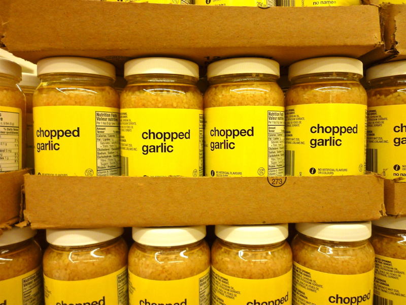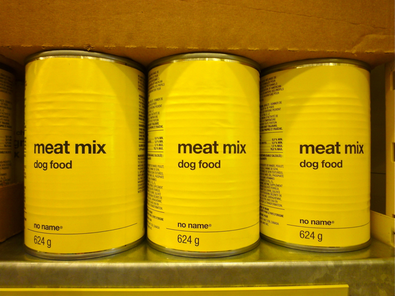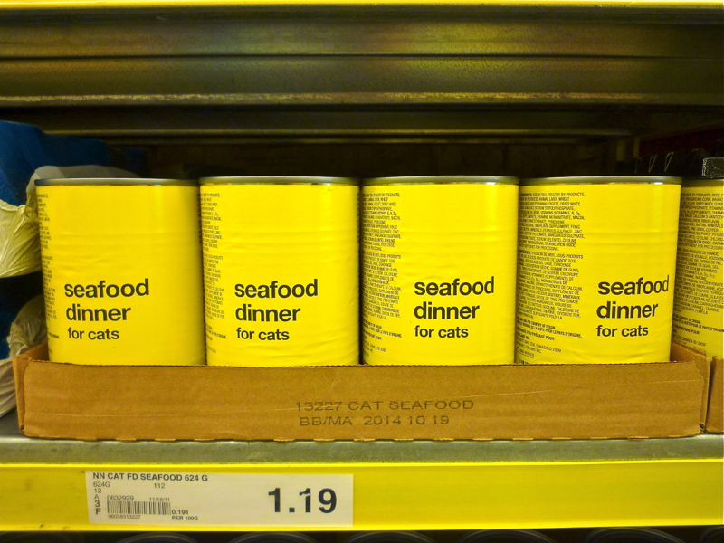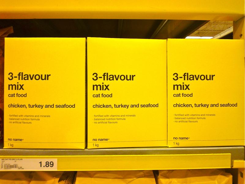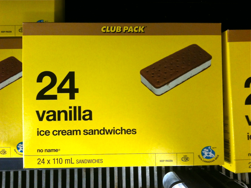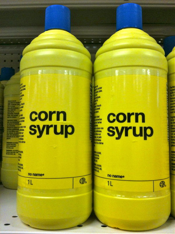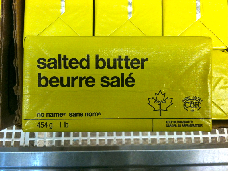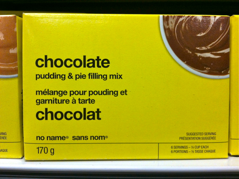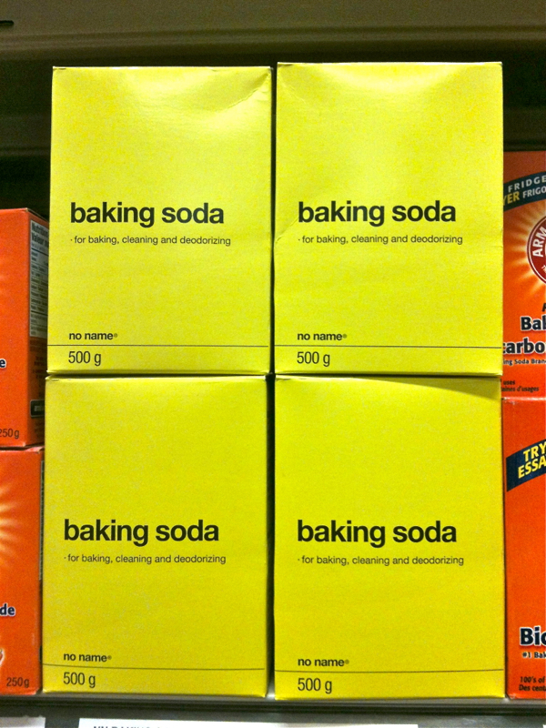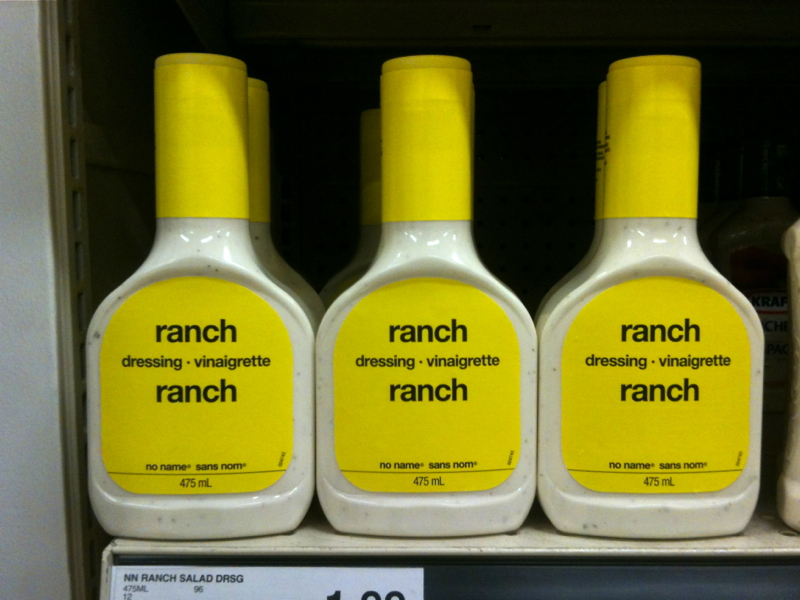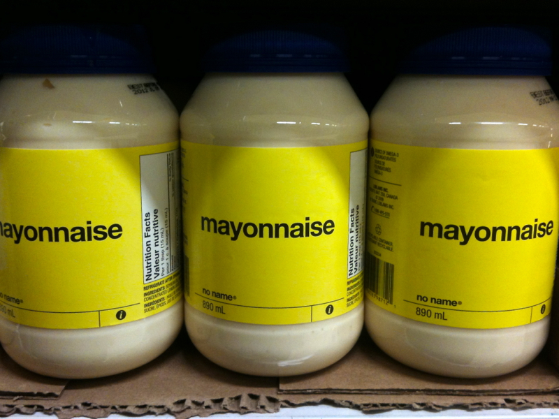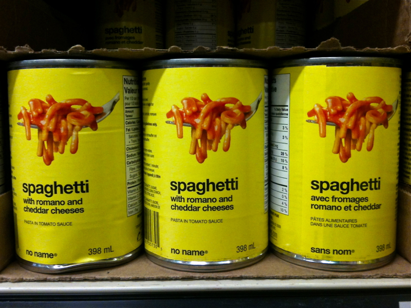
When I was ten years old part of my weekly adventure was accompanying my mother to the food store. In 1984, on Long Island, the major supermarket was Pathmark. At the time, I had no idea I wanted to be a designer. I had no idea I would come to love great advertising and marketing because of the emotional reach it could have. I had no idea great design could subconciously change peoples behavior. What I did know is that I loved the NO FRILLS aisle. The NO FRILLS aisle amalgamated all supermarket items from canned spaghetti to laundry detergent into one simplistic, typographically genius, less-is-more designed, perfectly merchandised row. At a time of “new and improved”, “extra-strength” and “free prize inside” package design the NO FRILLS aisle was way ahead of it’s time in both aesthetics as well as convenience. Think Apple Store and Muji. Years later, I now realize what I felt and my behavior in the NO FRILLS aisle were the catalyst for my entire career. In particular, my focus on the power of behavioral science in my designs, marketing and communication with consumers stems from this aha moment.
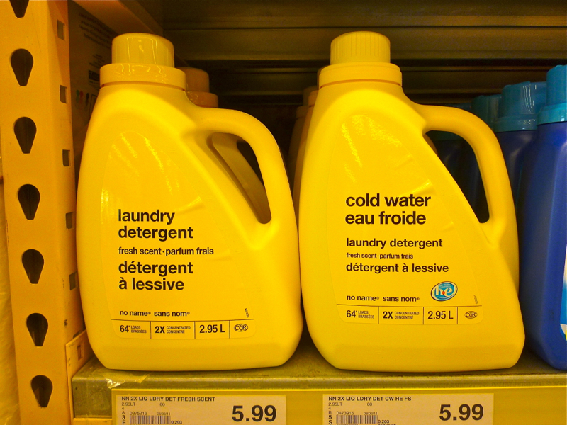
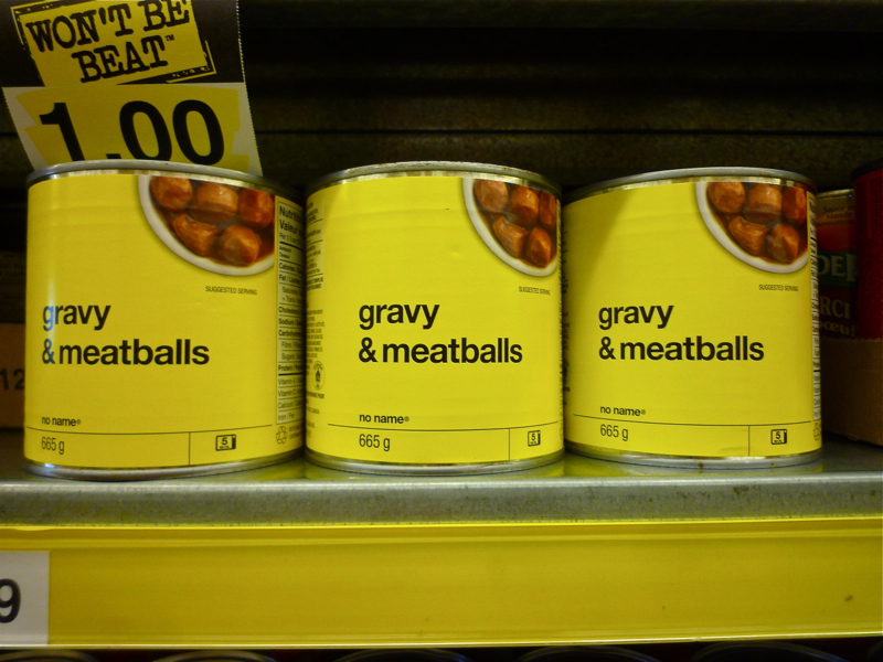
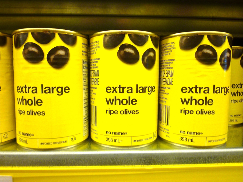
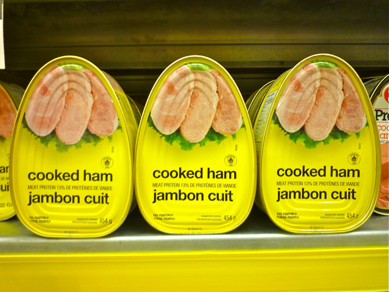
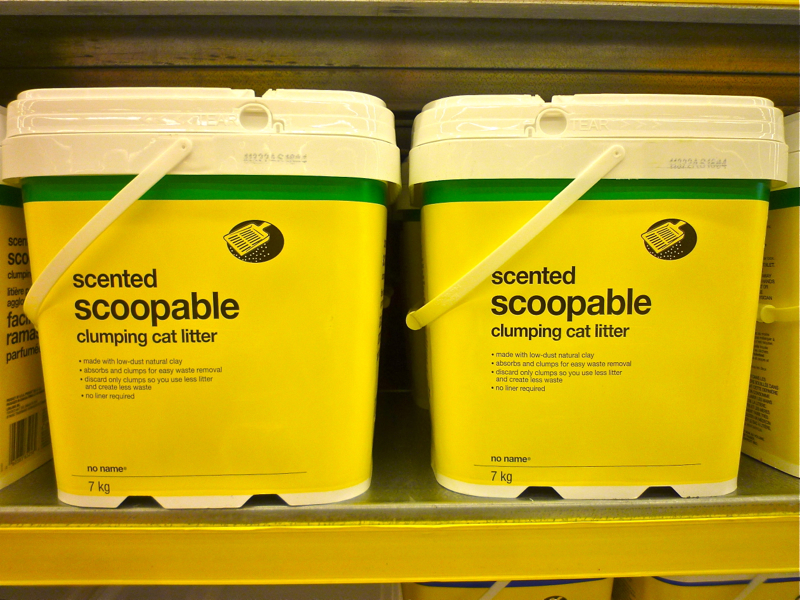
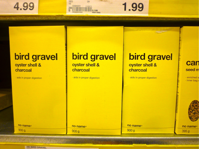
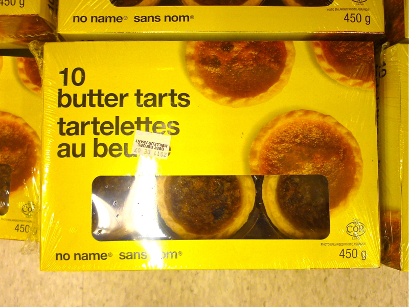
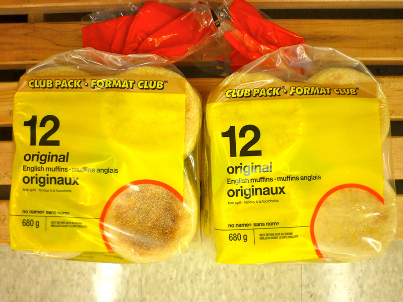
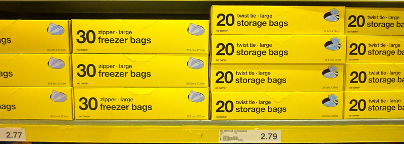
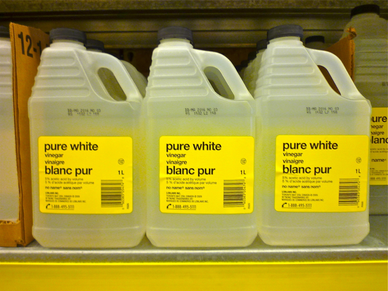
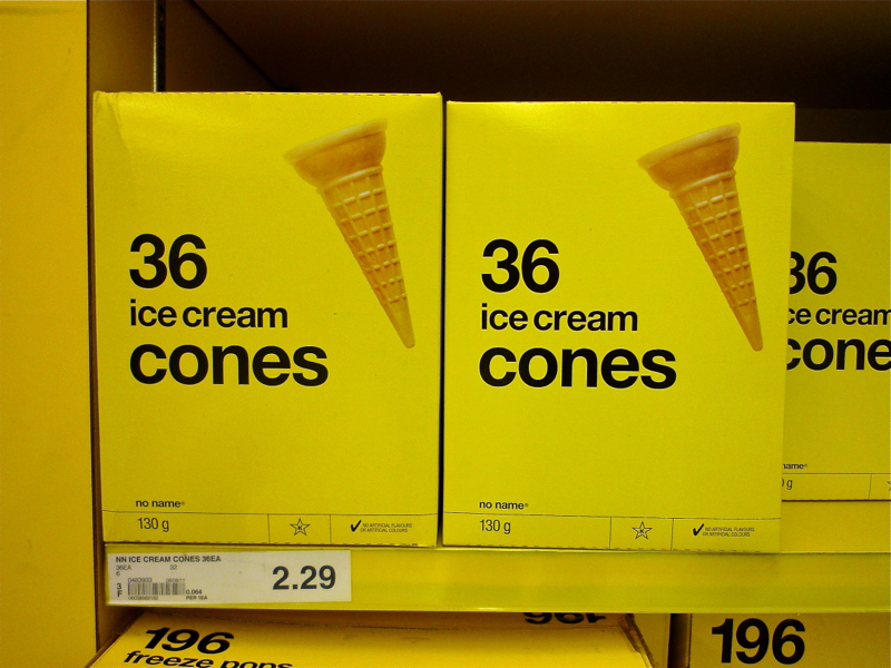
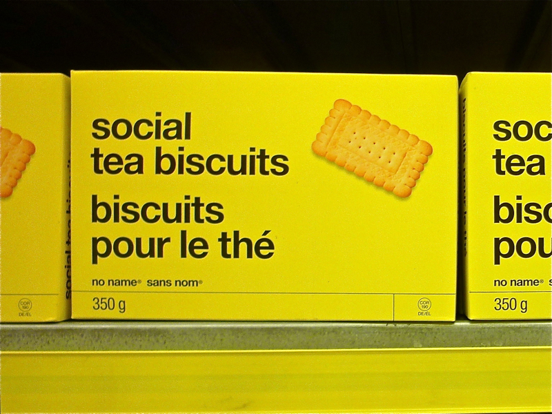
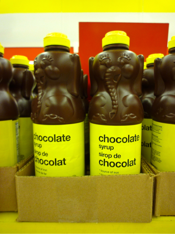
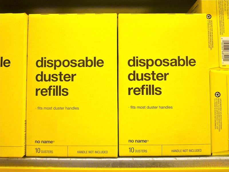
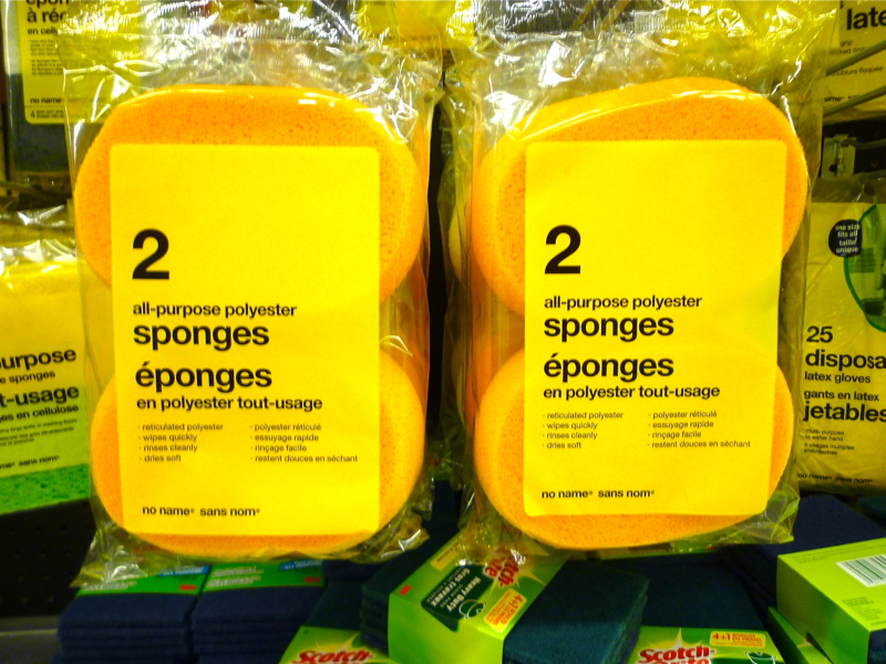
Sadly, the NO FRILLS aisle no longer exists. On a recent trip to Canada my Mother-in-Law took me to Loblaws, one of Canada’s largest supermarkets, for a special surprise. Although my treat was not the stark white packaging and bold black type synonymous of NO FRILLS branding, it was a very close second. The white was replaced with a bold, solid yellow and as an added bonus the reverse of each item I grabbed was in French. (Or English depending on the side I looked at first). Below is a visual review of my favorite items spanning a myriad of categories and a plethora of container shapes. In many ways I wish we could level set the human shopping experience to be as optionless as these standard items. It would help us focus on the things that matter most and not spend 15 minutes in the toothpaste aisle debating over the benefits of fluoride vs baking soda vs whitening.
