Pizza Valentines Card
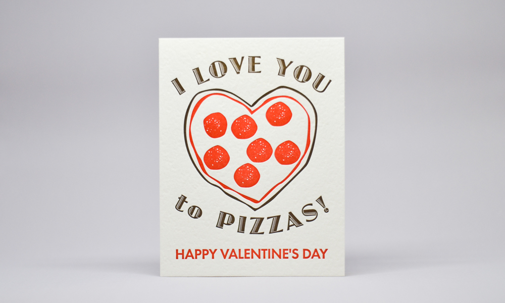
To kick off our run up to Valentines Day, let’s start with a puntastic card that also has my favorite food front and center. Giving this to my wife is like saying I love you more than anything in the know universe being that pizza ranks #2 just after her.