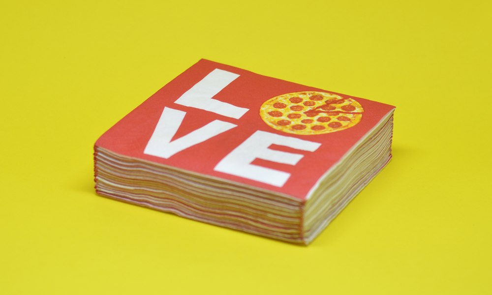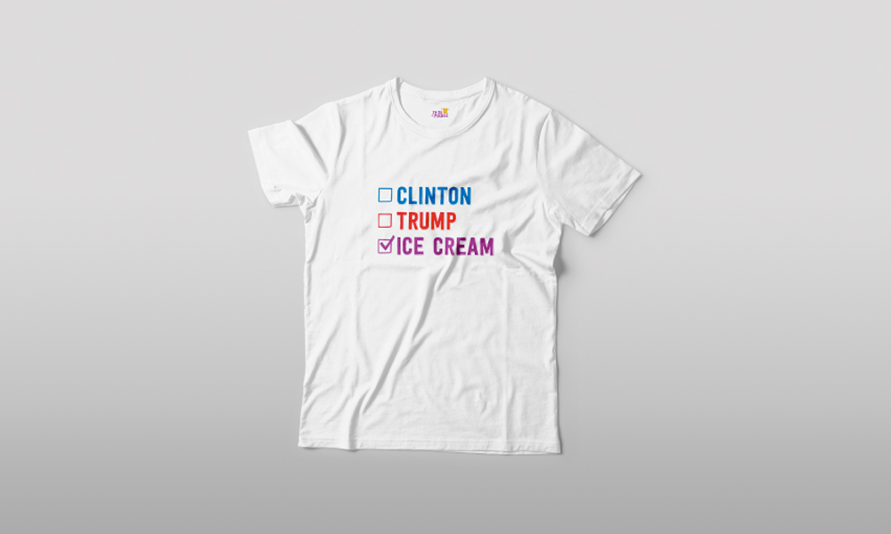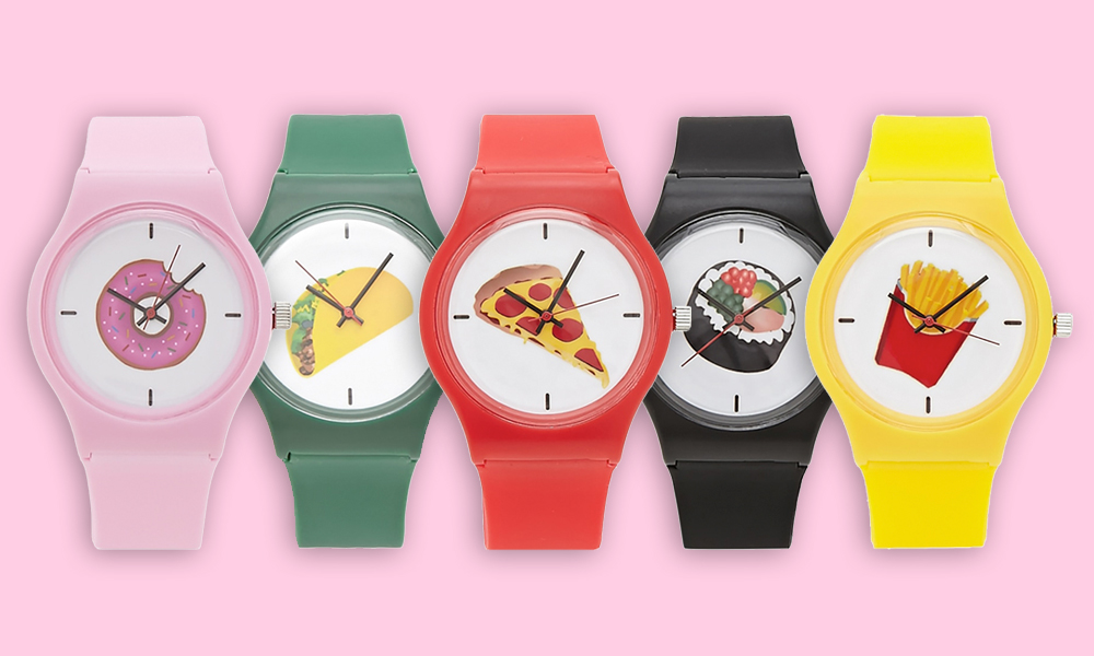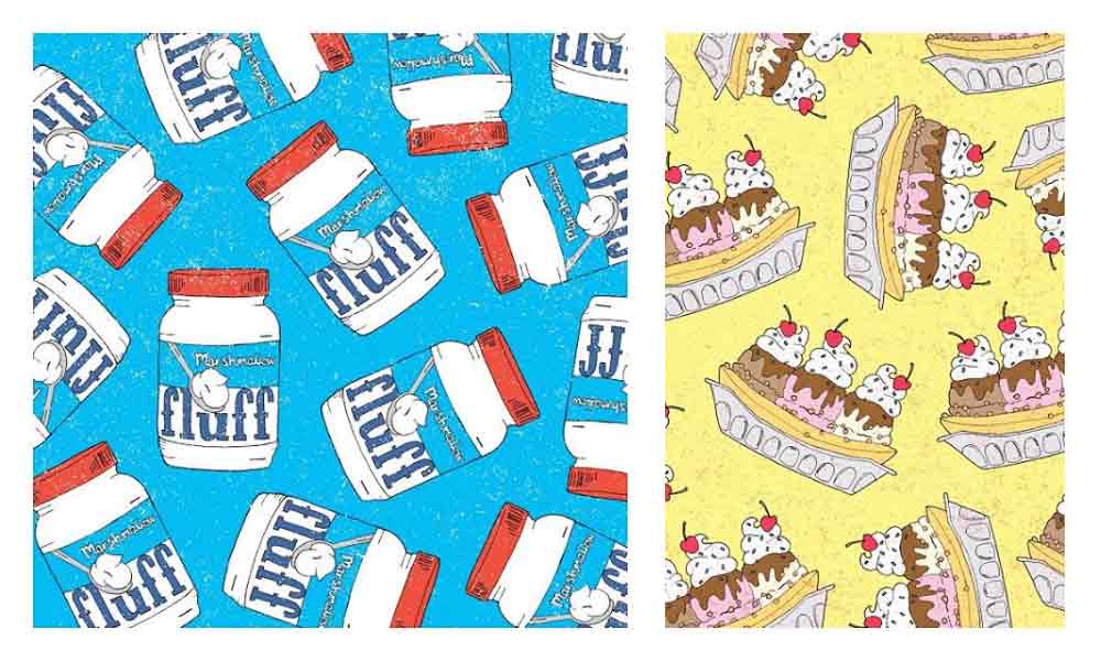
To lighten up this week a little, we’ve discovered @murcer and her texture enhanced, food pattern, illustrations. You an read deeping into why I chose fluff and and ice Cream split from the myriad of quirky designs she has up on @frenchtoastprints IG account. Click over. Stare into the food illustrated abyss for 5 minutes Skip her latest two illustrations and and keep your mind off the politics. You can email her for prints. Just check her profile.
More Design Stuff
Mission Grove Cardamom Coffee Soap
If I handed you a steak scented sponge you’d probably think I was pining for a role in True Blood. That’s why Mission Grove Cardamom Coffee Soap makes sure their blend of scents makes for the perfect clean, fresh, olfactory delight instead of a vampire induced, midnight frenzy. Mission Grove makes other scents but this South Indian and caffeine combination scratches two of our continual itches, love of the subcontinent and our habitual morning cup of comfort.
Raisin Mother’s Day Card
We love the Good Paper people. Gearing up to treat mom is sometimes one of the trickiest tasks of the year. It has to be good, funny, special, sentimental, not too much BUT just enough. Start out with this Thanks for Raisin Us card and you’re on the right track. Of course you need at least one sibling for it to make sense. After that maybe you go with a north African dinner reservation or a beach vacation for the big gift. There’s a theme her people. Go with it.
Rossi 1931 Paper
I’ve seen my share of Italian cakes and Pompeiian lemons. Maybe that’s why these papers jumped out at me. Call it a reprieve or an intrigue. The beauty of Rossi 1931 Papers are unmatchable. The metallic gold used to rim some of the cakes is an incredible detail. the texture of the lemons and the leaves pushes you to reach in and attempt to grab one. Once these beautiful 20 X 25 sheets are in your possession it’s up to you what you do with them. Framing them is certainly an option for these wall worthy beauties. I prefer to double treat with things like this. Now I just have to find the perfect, deserving gift to be wrapped with such works of art.
MEAT Nº1 by Sorry Design
A poster of meat. What more needs to be articulated about this 18” X 24” carnivorous, educational, orgy. The 2 color screen print pops off the rich, thick 100lb Cougar Natural cover stock begging to be cooked. Alas, the tooth of the paper breaks the reverie every time. The delightful bi-product is a trip to the butcher. Hanging this meat poster in the kitchen is obvious as it doubles as a reference guide but we prefer it over our bed so our porterhouse dreams are met with ribeye mornings. Yank Marc Howell and Limey Luke Paisley have a great hand. Their other designs, and apologetic company name, seems to be most fitting for their work, current design MOST poignantly included.